Why some spaces instantly calm us (and others don’t)
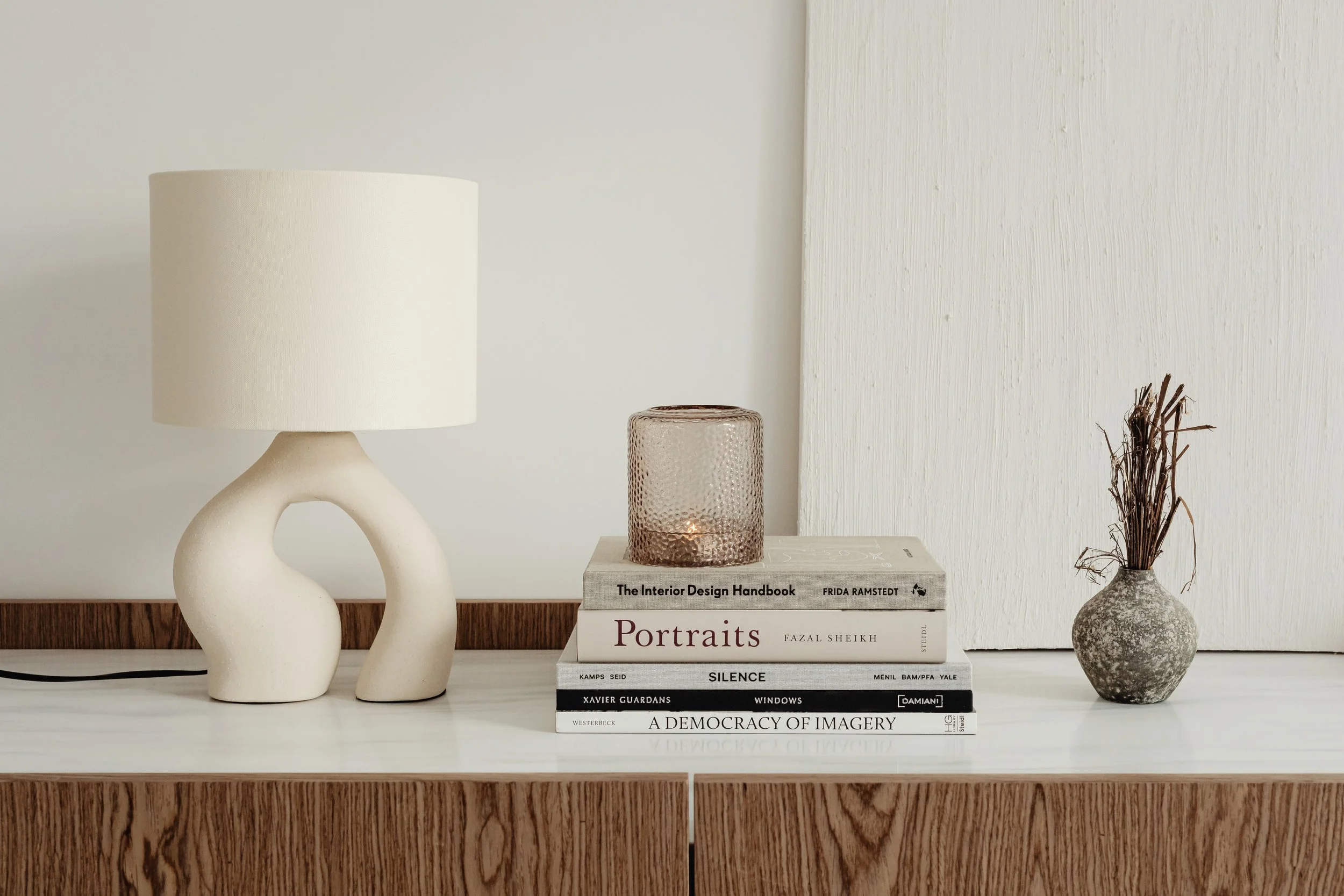
Throughout our lives we will visit countless different spaces. Some will feel familiar, bringing a sense of calm and peace; others will create a sense of chaos and discomfort. What is it really that makes us feel comfortable in some spaces, and completely uncomfortable in others? When I ask myself this question, I realise that spaces that are organised and uncluttered make me feel at my best. The way a space is designed - from layout and lighting to colour - quietly shapes how calm or overwhelmed we feel. There is nothing better than knowing that everything has its place. That a space is easy to navigate. There is a natural flow that feels good to the mind. And to feel good is the whole point in life. This feeling often begins in the places where we spend most of our time - our homes.
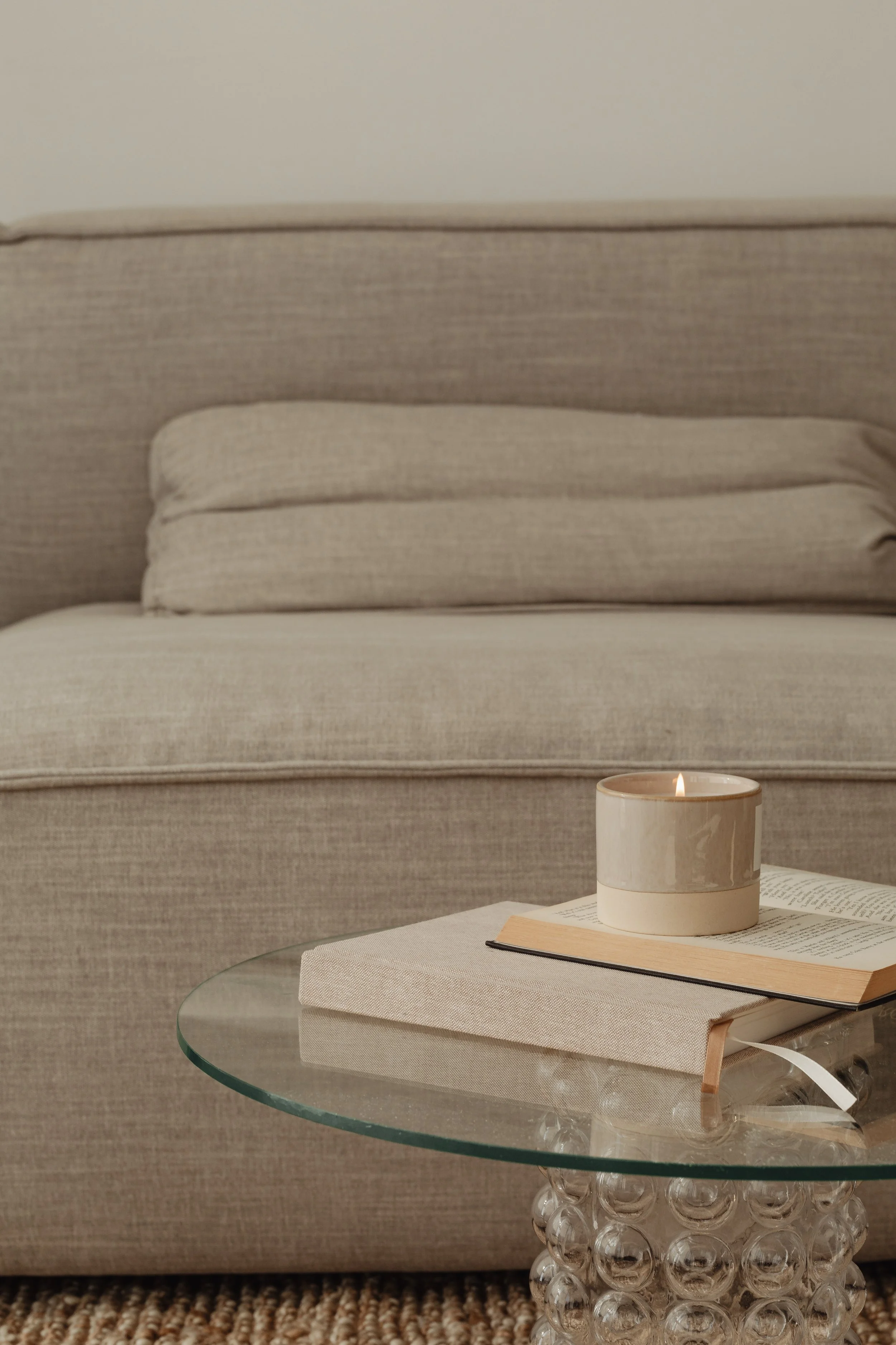
Beyond layout and order, there are quieter elements that shape how a space feels. One of them is lighting. I love natural light during the day, but I also have the same kind of love for creating a cosy atmosphere with artificial lighting. Lighting itself is a vast subject that I’m excited to explore further in future publications. There are so many hues and forms of light, which is what makes it so fascinating.
If chosen without reflection, lighting can overwhelm a space or cause discomfort. But when chosen thoughtfully, it can transform even rooms with limited access to natural light. The atmosphere created by the right lighting can feel like a balm to the soul - especially in the winter months, when days are short and there is nothing more comforting than settling into a quiet corner of the home.
Once light is considered, colour becomes the next layer of atmosphere. Colour has a quiet but powerful influence on how we feel in a space, shaping mood, emotion, and overall wellbeing. The choices we make are rarely neutral; they speak directly to our nervous system.
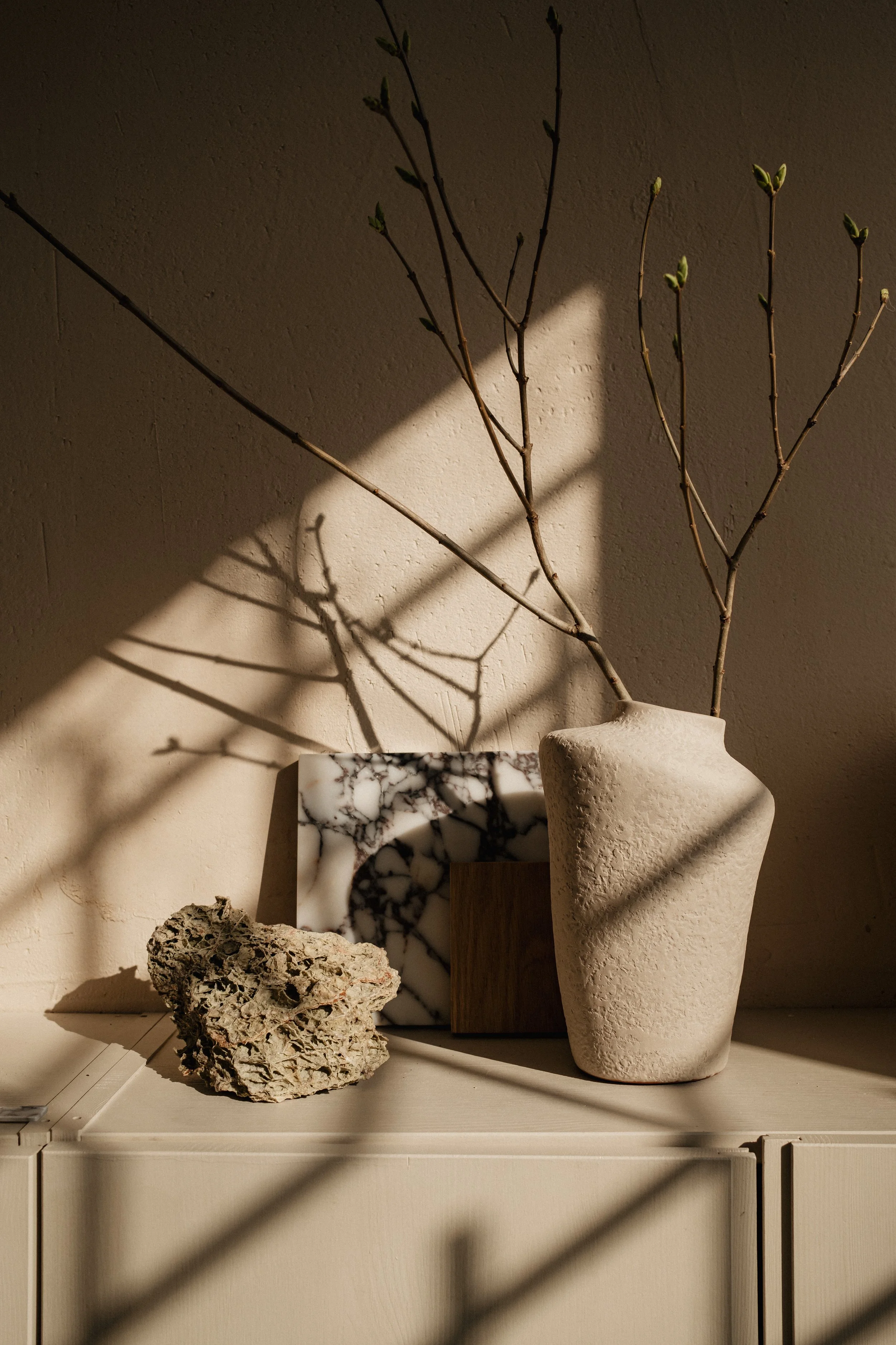
When thinking about calm and peace, I’m naturally drawn to softer, muted tones. Beige, in all its variations, is one of my favourites. It carries a sense of warmth and timelessness, making it especially suited to bedrooms, living rooms, hotel interiors, and spaces meant for rest. At the same time, too much beige can feel indistinct - almost like a blank canvas waiting to be shaped.
This is where layering becomes essential. Linen curtains, velvet textures, soft wool - when combined thoughtfully, they add depth and character without disrupting calm. Even subtle contrasts, such as mixing beige with gentle shades of grey, can bring quiet dimension to a space. Blue is another colour that naturally evokes serenity, particularly in its lighter forms. Soft blues paired with whites and creams can create interiors that feel restful and expansive, especially in bedrooms and living spaces. Green, too, carries calming qualities - especially in its lighter shades. Deeper greens, such as emerald, introduce richness and sophistication, working beautifully as accents through cushions, candles, or small decorative details. For me, these colours share one important quality: they support calm without demanding attention. They allow a space to breathe.
Calm is not a style. It is a relationship with space.
One that asks for attention, reflection, and care. Perhaps the most important thing we can do is notice how a space makes us feel - and trust that feeling enough to respond to it.